No matter what industry you’re in, it’s good to know the numbers that are leading and lagging indicators of how your business is performing.
The same is true in marketing: You should understand “the numbers” of your website. For most of our clients, those numbers come in the form of Google Analytics metrics. In 2023, Google updated their system from Universal Analytics to GA4. In light of this, there are a few changes you should be aware of as you review your monthly reports from the E47 team!
Let’s dive in and take a quick look at what they mean.
Understanding Your Google Analytics Metrics
Let’s Start at the Top

At the top of your Google Analytics report is the “Summary,” which shows the dates covered in the report. In most cases, we set the “comparison” numbers to the previous month to show how the metrics have changed. However, for some clients, we utilize year-over-year comparisons if their industry is more seasonal.

Next are raw numbers for “Total Website Visits” and “Unique Website Users”:
- Total Website Visits (sessions): This is the total number of browsing sessions on your website in a month.
- Unique Website Users: This is the total number of users (people) who browsed your website in the month.
As you can see, there were more sessions than users, which indicates some users visited this website multiple times.
Where Traffic is Coming From

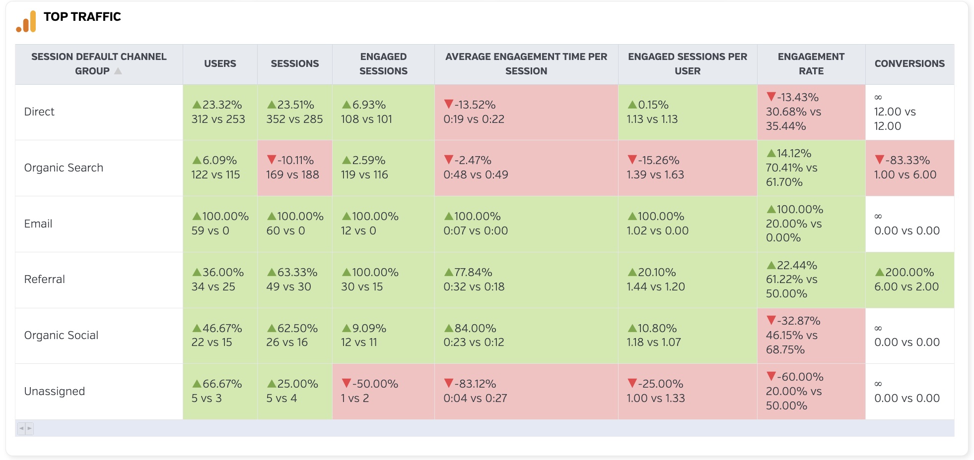
Your website’s traffic is broken down into several unique categories:
- Direct: Users who typed your website domain into a browser and went directly to it. These number can, at times, be skewed by spam/bot traffic.
- Organic Search: Users who used a search engine and clicked on an organic (non-paid) listing in the search results.
- Referral: Users who clicked on a link to your website from another website.
- Social: Users who clicked on a link in a social media post (yours or others) and landed on your website.
- Email: Users who clicked on a link to your website in an email you (or someone else) sent out to people.
Depending on your marketing efforts, you may see other categories here as well (paid search, paid social, display ads, etc.).
The columns to the right of it show the data for the month and the difference between the comparative previous month. Let’s take the “Direct” traffic and do a quick analysis of the numbers:
- Users: A bit self-explanatory here, but these are the number of users who came to your site through that specific traffic type. You’ll see that 312 users came to this site through the direct URL compared to 253 users in the month before.
- Sessions: This is the same “sessions” described at the top of the page. In August 2024, there were 352 visits vs. 285 visits in July, an increase of 24%.
- Engaged Sessions: This new GA4 metric lets you know if users were actually engaged with your website during the last month. A site visit counts as an engaged session if users stayed on your site for more than 10 seconds, engaged with an event (e.g.: clicked on a specific CTA button set up to track conversions), and/or had 2 or more page views.
- Avg. Engagement Time per Session: Similar to session duration in the old Google Universal Analytics, how long was the average user engaged with your site? The longer the time per session, the better.
- Engaged Sessions per User: This one is just a bit more granular than engaged sessions up above, showing you individual users’ interactions with your site.
- Engagement Rate: In the past, Google used “bounce rate” to describe the amount of people that came to your website and didn’t stay around. The lower the bounce rate, the better it was for your site because it meant more individuals clicked through to more pages. Now, in GA4, they use a metric called “engagement rate” which is the percentage of engaged sessions on your site – aka the exact opposite of bounce rate. The higher the engagement rate, the better!
- Conversions: If conversion tracking is set up on your website, you’ll see exactly what traffic types led you to get a conversion. Typically, this is people filling out forms, calling a phone number, signing up for an email newsletter, etc.
Referral Domains

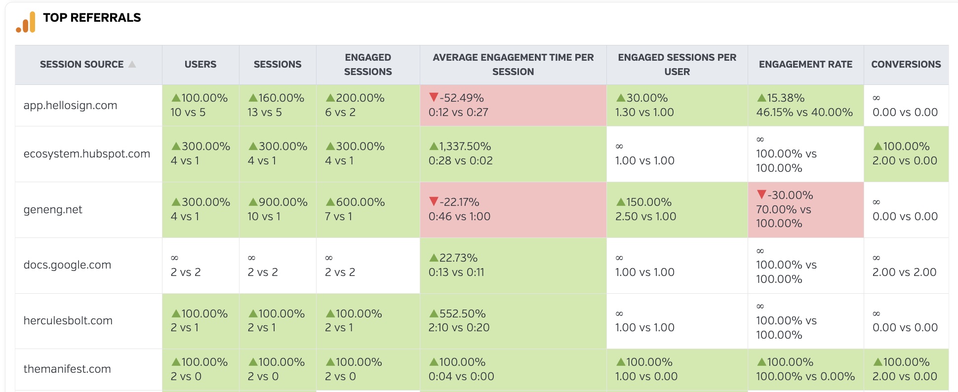
The Referrals section of the reports is simply a breakdown of the data on visitors who arrived at your website from another website (not from a search engine). As in the examples above, the percentage is the increase or decrease over the comparison month for the traffic from the URL (domain) listed at the left. This data helps you understand what websites are sending you the most “referral traffic” each month.
Landing Pages

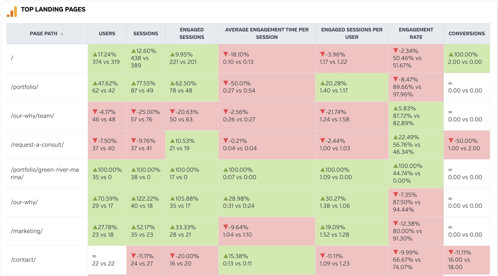
“Top Landing Pages” shows the pages on your site that were the most popular entry points for visitors. In this example the “/” indicates the home page and is the most popular way for someone to enter this site, followed by /portfolio/, then the /our-why/team/ page, and so on.
Again, the numbers are the same concepts as those above. You’ll be able to see what pages resonate the most with your audiences, how long they’ve stayed on your site, and if any of the pages converted the site users into leads.
Let’s Get Social

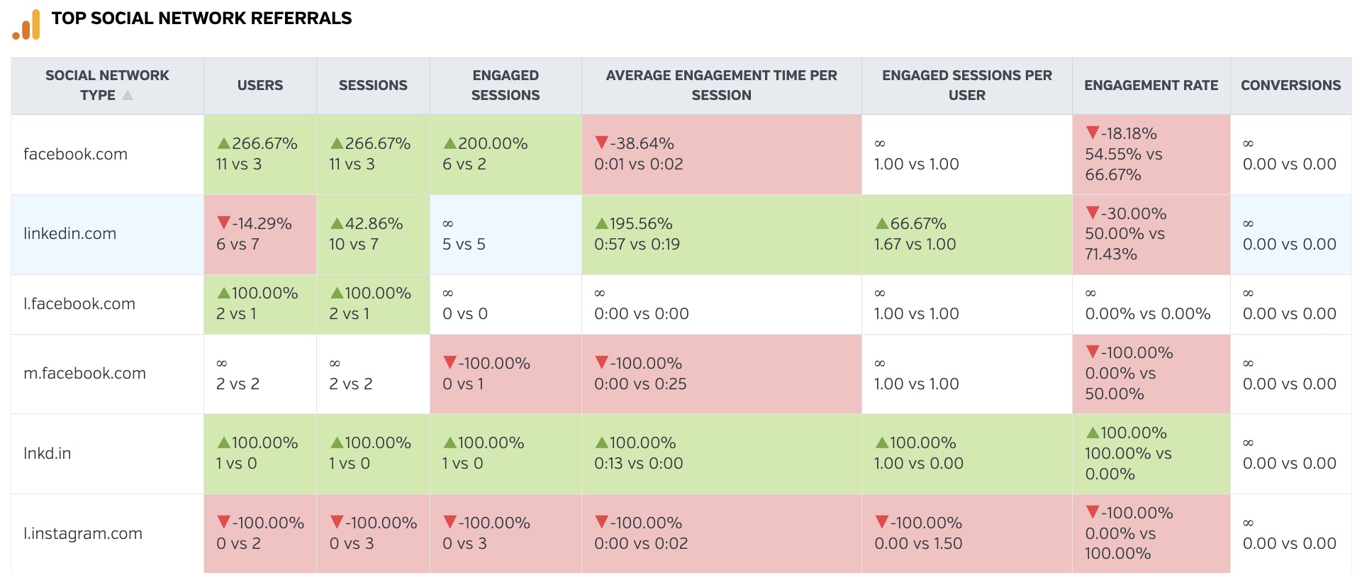
The final section of the monthly reports (unless you’re running digital ads) is typically the “Top Social Network Referrals” section. It’s still using the same data as the examples above, but filtered to only show traffic that came from the various social media platforms. While direct URLs like facebook.com and linkedin.com are instantly recognizable, the ones that feature an “l” or “m” at the beginning might leave you a little confused. Basically, if you see one that has an “m”, it means users came from the mobile version of the social platform instead of the web browser version. And the “l” means the user went through some sort of secondary link before getting to your site (think of Instagram accounts saying “link in bio” and the user going to click on that bio link instead of leaving social media app to get to your website).
Hopefully this guide is a great start to helping you understand how people are interacting with your site. Have questions? Need more info? We’re just an email or phone call away!